
✦ AI Summary
Table of Content
▲
The single biggest factor separating a gallery wall that looks professionally designed from one that looks accidentally assembled isn't the art you choose; it's whether you get two specific technical details right: height and spacing. Get those two things correct and almost any reasonable layout style will look intentional. Get them wrong and even genuinely beautiful individual pieces will read as careless.
A gallery wall is one of the easiest ways to turn an empty wall into a personalised focal point. For more inspiration, explore these wall painting and photo wall ideas for home.
This guide leads with those two rules first, since they matter more than anything else here, then covers current 2026 layout styles, genuinely distinctive Indian design trends, and a low-risk method for testing your layout before you put a single nail in the wall.
Get These Two Rules Right First: Height and Spacing
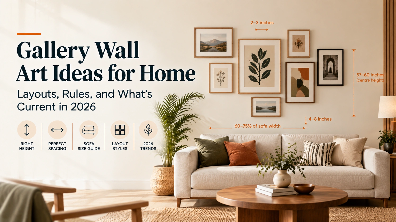
Height: the well-established, consistently corroborated standard, used by museums and interior designers worldwide, is to centre your arrangement 57 to 60 inches (roughly 145-150 cm) from the floor. This is the single most commonly violated rule in home gallery walls: most people hang art too high, at their own personal eye level while standing, rather than at the standardised eye-level height that accounts for how a room is actually used, seated on a sofa, walking through a hallway, or lying in bed. Treat a multi-frame arrangement as one single piece for this purpose: the entire collection's visual centre, not the top of the highest frame or the centre of any individual piece, should land in that 57-60 inch range. Rooms where people are typically seated (living rooms, bedrooms) can lean toward the lower end of the range; hallways and kitchens, where people are usually standing and walking through, can lean toward the higher end.
Spacing: keep a consistent 2 to 3 inches (roughly 5-7.5 cm) between frames. This is a genuinely important, easy-to-get-wrong detail: measure the actual visual gap between frame edges, not the distance between nail holes, since frame thickness and mat width vary and nail-hole-based measurement can produce visibly inconsistent gaps even when your math seemed right on paper.
Both of these standards apply regardless of which specific layout style you choose below; get them right and even a loosely eclectic salon-style wall will read as deliberate rather than random.
Sizing a Gallery Wall Above Your Sofa
This is the single most common gallery wall application, and it has its own specific sizing rule worth knowing precisely: the total width of your arrangement should span roughly 60 to 75% of the sofa's width beneath it, and the bottom edge of the frames should sit 4 to 8 inches above the furniture. A gallery wall that's too narrow relative to the sofa looks visually disconnected and undersized; one that's too wide overwhelms the seating arrangement beneath it. This same furniture-relative logic extends to any gallery wall placed above a console table, sideboard, or headboard, size the arrangement to the furniture beneath it, not to the total available wall space.
Test Before You Commit: The Paper Template Method
This is worth doing every time, regardless of how confident you feel about your planned layout. Trace each frame onto kraft paper or newspaper, cut the tracings out, and mark the exact hanging point on each template. Tape the paper templates to your wall in your planned arrangement, using painter's tape so they're easy to reposition, and step back frequently to assess the overall balance from a normal viewing distance, not standing directly in front of the wall. Adjust as needed, live with the paper arrangement for a day or two if you can, and only once you're genuinely satisfied should you transfer the marked hanging points to actual nails. This single step prevents the single most common, hardest-to-fix gallery wall mistake: a finished arrangement with visibly unnecessary extra holes from a layout that didn't work as well on the wall as it did in your head.
Layout Styles That Work in 2026
The Symmetrical Grid
An evenly-spaced grid (3×3 for a smaller wall, 2×4 or 3×4 for a larger above-sofa arrangement) using consistent frame sizes and styles. This suits modern, minimalist homes and reads as calm and orderly. It's also the most forgiving layout for a first-time gallery wall builder, since consistent spacing and frame sizing do most of the visual work for you.
Salon-Style Eclectic
A looser, more personal arrangement mixing different frame sizes, orientations, and art types (photographs, prints, and smaller decorative objects together), built around a central anchor piece, typically your largest or most visually significant item, with everything else arranged outward from it. Current 2026 style specifically favours a more collected-over-time, imperfect feel over strict, matched symmetry, gaps and slight asymmetry are increasingly seen as making an eclectic collection look genuinely curated rather than incomplete. This style works particularly well for family photo walls and personal, meaningful collections, since it doesn't require matching frames or a uniform art style to look cohesive.
Staircase Runner
A diagonal or stepped arrangement following the rake of a staircase, keeping consistent spacing between frames while allowing the overall line to follow the stairs upward. This is one of the more visually striking applications precisely because the sloped wall space isn't well-suited to any other furniture or decor, making it genuinely good use of an otherwise underutilised wall.
The Renter-Friendly Lean
The lowest-commitment version of a gallery wall: pieces leaning against a mantle, console, or floating shelf rather than hung on the wall at all, overlapping slightly, in a few varied heights. This is particularly good for renters who can't put holes in walls, or for anyone who wants to update and rearrange their collection frequently without needing to re-patch and repaint.
Current Indian Design Trends Worth Knowing
This is where genuinely distinctive, India-specific content diverges from the Western layout and technique guidance above, and it's worth knowing regardless of which layout style you choose.
Heritage motifs in contemporary palettes: traditional Indian art forms, Pichwai paintings, Madhubani folk art, and Mughal miniatures, are increasingly being reimagined in updated colour palettes like sage green, terracotta, and champagne gold, rather than their traditional colourways, giving a genuine sense of cultural identity and craftsmanship without reading as dated or overly traditional against modern, clean-lined furniture.
Spiritual art in modern treatments: traditional devotional imagery (Krishna, Shiva, Buddha, and similar) is seeing a genuine shift away from conventional calendar-style depictions toward contemporary treatments, neon palettes, geometric patterns, and digital-glitch aesthetics, a distinctly current, India-specific trend with no real Western equivalent.
The single large statement piece as an alternative: rather than a full multi-frame gallery wall, many current Indian interiors are instead choosing one large, oversized canvas or painting (a sweeping abstract landscape or large-scale heritage portrait, for instance) as the sole focal point for a wall, particularly effective in smaller apartments where a single anchor piece can make the room feel more expansive than a busier, denser multi-frame arrangement would.
If you're drawn to this statement-piece approach rather than a traditional multi-frame gallery wall, the height rule above still applies, centre the single piece at 57-60 inches, but the spacing and grid considerations become less relevant, since you're working with one dominant element rather than a coordinated collection.
Room-by-Room Layout Guidance
Living rooms: the above-sofa grid or salon-style arrangement is the default, most-searched application, sized per the furniture-relative rule above.
If you are combining artwork with a feature wall, these accent wall ideas for living rooms can help you decide which wall should carry the visual focus.
Hallways and staircases: favour a narrower, vertically-oriented column or a staircase runner following the stairs' rake, keeping consistent spacing and, per the room-specific height guidance, leaning toward the higher end of the eye-level range since people are typically standing and walking through these spaces.
Bedrooms: a smaller, more intimate arrangement above a headboard or dresser, sized similarly to the above-sofa rule but generally leaning toward the lower end of the height range, since bedrooms are typically viewed while seated or lying down.
Family photo walls specifically: current 2026 trends favour smaller, more intentional 3-4 frame groupings with genuine breathing room between each photograph, a shift away from the larger, denser grids that were more common in previous years.
Homeowners who also consider Vastu can refer to these Vastu-compliant colours for home walls when choosing the background colour for their gallery wall.
Common Mistakes to Avoid
- Hanging at your own personal standing eye level rather than the standardised 57-60 inch range, which is the single most common mistake and tends to place art noticeably too high, especially in rooms with tall ceilings.
- Measuring spacing from nail holes rather than the visual gap between frame edges, which can produce inconsistent-looking spacing even when your measurements seemed correct.
- Sizing an above-sofa arrangement too narrow or too wide relative to the sofa beneath it, rather than targeting the 60-75% width guideline.
- Skipping the paper template step and hanging directly, risking unnecessary, hard-to-patch extra holes from a layout that doesn't work as well on the wall as it did in planning.
- Starting too large for a first attempt, overwhelming a smaller wall or room; beginning with a smaller arrangement and expanding once you've assessed how it feels in the space is a more forgiving approach than committing to a large, dense layout from the outset.







Ans 1. Centre the entire arrangement, treated as one single piece, at 57-60 inches (roughly 145-150 cm) from the floor. This is the standard used by museums and designers worldwide. Rooms where people are typically seated can lean toward the lower end; hallways and standing spaces can lean toward the higher end.
Ans 2. Keep a consistent 2-3 inches between frames, measured as the actual visual gap between frame edges, not the distance between nail holes, since frame thickness varies and can make nail-hole-based measurements misleading.
Ans 3. The total arrangement should span roughly 60-75% of the sofa's width, with the bottom edge of the frames sitting 4-8 inches above the furniture. This furniture-relative sizing applies to any gallery wall placed above a piece of furniture, not just a sofa.
Ans 4. Trace each frame onto kraft paper, cut out the tracings, mark the hanging point on each, and tape them to the wall in your planned arrangement using painter's tape. Adjust as needed before transferring the marked points to actual nails, which prevents unnecessary, hard-to-patch holes.
Ans 5. Yes, this is the salon-style eclectic approach, built around a central anchor piece with everything else arranged outward from it. Current 2026 trends specifically favour this more personal, collected-over-time look over strict, matched symmetry.
Ans 6. Heritage motifs (Pichwai, Madhubani, Mughal miniatures) reimagined in contemporary palettes like sage green and terracotta, spiritual art in modern geometric or neon treatments, and a single large statement piece as an alternative to a multi-frame gallery wall are all genuinely current, distinctly Indian design directions.
Ans 7. Leaning pieces against a mantle, console, or floating shelf, overlapping slightly at varied heights, is the lowest-commitment version of a gallery wall and requires no wall holes at all, making it easy to rearrange or update over time.
Ans 8. Hanging the arrangement too high, at their own personal standing eye level rather than the standardised 57-60 inch range, which is the single most common and most visually noticeable gallery wall mistake.