Table of Content
▲
These POP design colour ideas have the power to elevate the overall aesthetics and decor of your home, making it an equally appealing choice for commercial spaces, offices, shops, and more. Below, you'll find a curated list of 15 captivating POP design colours that can transform your home's atmosphere into a visual delight.
POP Design Colour Ideas for Home
Turquoise and White POP Design Color for Hall
Turquoise, a mesmerizing blend of blue and green POP design colour, possesses the ability to infuse your hall ceiling with an exuberant and visually appealing appearance. To enhance this effect, pairing it with a white backsplash is highly recommended, as it will harmonize with the vibrancy of the POP design colour, creating a stunning and balanced aesthetic.
[caption id="attachment_9288" align="aligncenter" width="500"] Turquoise white ceiling color[/caption]
Baby Pink for Your Playful Charm
Baby pink, a color that exudes femininity yet captivates the hearts of all, makes for an ideal POP design colour theme for your ceiling pop design. Choosing a baby pink POP design colour scheme will infuse your home with a playful and charming atmosphere that appeals to a wide range of tastes and preferences.
[caption id="attachment_9289" align="aligncenter" width="375"] Playful baby pink ceiling[/caption]
Red and White for Your Bold Room
The combination of red and white is a timeless and universally appealing choice. Your POP design colour scheme for the room would exude an exotic and luxurious aura in these shades. Don't overlook the addition of white focus lights, as they will enhance the overall ambiance, setting a glamorous and captivating mood that truly ignites the room's allure.
[caption id="attachment_9290" align="aligncenter" width="500"] Red and white pop ceiling[/caption]
Bright Yellow for Your Daily Sunshine Boost
Bright yellow, a POP design colour that consistently uplifts one's spirit, is an excellent choice for your ceiling pop design scheme. This vibrant and energetic POP design colour will infuse your space with a lively ambiance, ensuring you feel motivated and enthusiastic throughout the day. It serves as a constant source of inspiration, encouraging you to work harder and embrace each moment with renewed vigor.
[caption id="attachment_9291" align="aligncenter" width="500"]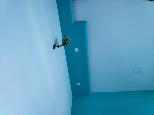 Yellow ceiling pop color[/caption]
Sip Your Coffee in a Hall of Coffee Colour
Opting for a coffee-themed POP design colour for your hall is undoubtedly one of the finest choices you can make. Imagine sipping your cup of coffee in a space where the pop design colour harmonizes perfectly with your brew, creating a tranquil and stress-relieving atmosphere. It's a delightful synergy that transforms your hall into a soothing haven where you can unwind and savor your coffee while leaving your stress behind.
[caption id="attachment_9292" align="aligncenter" width="500"]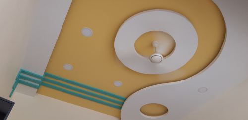 Beautiful coffee pop hall design[/caption]
Pure White Matte Look for Your Peaceful Home
White, a POP design colour symbolizing peace and tranquility, is an excellent choice for your ceiling. A matte white finish on your POP ceiling not only imparts a sense of peace and serenity but also exudes a high level of sophistication. Additionally, this POP design colour is considered auspicious in accordance with Vastu shastra, making it a harmonious and elegant choice for your living space.
[caption id="attachment_9293" align="aligncenter" width="500"] Peaceful ceiling pop color[/caption]
Yellow and Grey for Your Geometric Pattern Ceiling
Indeed, a single POP design colour would not do justice to the intricate beauty of a geometric pattern ceiling. To truly accentuate the design, the contrast of yellow and grey, combining the brightness of yellow with the subtlety of grey, is the optimal choice for such a POP ceiling design. This harmonious blend of POP design colours creates a visually stunning and captivating effect, emphasizing the intricacies of the geometric pattern and adding depth and dimension to the space.
[caption id="attachment_9294" align="aligncenter" width="500"] Geometric pop ceiling design color[/caption]
Pistachio Green for Your Modern Home
The neutral pistachio shade is a beloved choice among the modern generation. To infuse a touch of modernity into your home decor, consider painting your wall pop design with a soothing pistachio green POP design colour. This color not only exudes a contemporary feel but also has a calming effect on the eyes, making it a wonderful choice for creating a serene and stylish living space.
[caption id="attachment_9295" align="aligncenter" width="500"]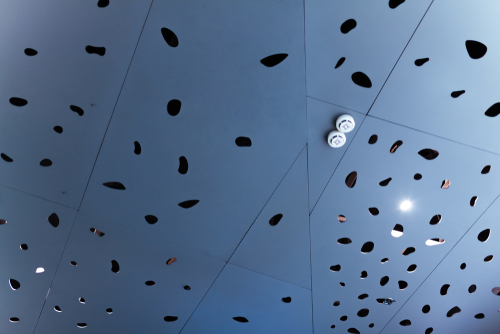 Pistachio green color for pop walls and ceilings[/caption]
Olive Grey for a Nude Look
Achieving that popular nude aesthetic that has been all the rage for the past half-decade is a breeze with the addition of the olive-grey nude POP design colour to your home. Not only does this color exude chic sophistication, but it also radiates a serene and tranquil ambiance, making it a perfect choice for a contemporary and stylish interior.
[caption id="attachment_9296" align="aligncenter" width="500"] Nude olive grey color for pop designs[/caption]
Go Monochrome Like a Pro
Monochromatic color schemes have enduring appeal in both modern and vintage home decor. The timeless elegance of a black and white monochromatic theme makes it an excellent choice for your pop design colour in home decor. This classic combination not only exudes a sense of sophistication but also brings an ecstatic and balanced aesthetic to your living space, transcending the boundaries of time and style.
[caption id="attachment_9297" align="aligncenter" width="500"] Monochrome pop designs[/caption]
Dive Into the Ocean of Sea Blue
When it comes to your bedroom, creating a calming and soothing atmosphere is essential. Opting for a sea blue POP design colour for your ceiling can work wonders in achieving this goal. The serene and tranquil nature of this POP design colour will not only soothe your eyes but also bring a sense of relaxation to your soul every time you gaze upon it. It's a perfect choice to create a peaceful haven in your bedroom.
[caption id="attachment_9298" align="aligncenter" width="500"] Sea blue color for pop ceiling[/caption]
Orange on Off-White for a Quirky Look
For those who have a penchant for breaking away from conventional color schemes, here's something that might pique your interest. Consider using an unconventional POP design colour scheme for your POP tray ceiling, featuring vibrant layers of orange and off-white. This unique combination can infuse your space with a quirky and groovy vibe, making it stand out and adding a playful touch to your decor.
[caption id="attachment_9299" align="aligncenter" width="500"] Quirky color pop ceiling[/caption]
The Milk Chocolate Covered POP Design Colour for Hall
To enhance the aesthetics of your hall designed with POP design colours, consider covering it with a harmonious combination of milky white and chocolate hues. Painting the center of the ceiling with a rich chocolate brown and the walls with a soothing milky white creates a balanced and inviting atmosphere. This POP design colour scheme adds a touch of sophistication and warmth to your hall, making it a welcoming and stylish space for all to enjoy.
[caption id="attachment_9300" align="aligncenter" width="500"] Delicious ceiling color decoration[/caption]
Rely on Purple Silky-Smooth POP Design Colour Unit
Introducing a purple POP design colour for your TV unit can infuse your space with a tropical beachy vibe, evoking a sense of relaxation and serenity. To fully capture this aesthetic, it's crucial to ensure the texture remains smooth and sleek, completing the look and maintaining the soothing and inviting atmosphere associated with beach-inspired decor.
[caption id="attachment_9301" align="aligncenter" width="500"] Purple pop tv unit color[/caption]
The Dark Bottle Green Color for a Minty Vibe
Maintaining the freshness of your home is paramount, and you can achieve this while adding a touch of elegance with a bottle green POP design colour. This choice ensures that your space retains its fresh, minty vibe while also introducing a calming and sophisticated atmosphere through the selected POP design colour, seamlessly blending aesthetics with comfort.
[caption id="attachment_9302" align="aligncenter" width="500"] Bottle green pop color[/caption]
Innovative Pop Ceiling Painting Ideas:
If you’ve always believed that white is the only color available for pop ceilings, you’re completely mistaken! You can choose vibrant interiors that will energize the space and make it more cheerful. Here are some painting ideas and color combinations to try:
- Bright Colors: Green, Orange, Dark Blue etc, serve as a perfect contrast for a white ceiling. If you want to use them all over the roof, then keep the crown moulding in lighter shades, preferably white or metallics.
- Light Colors: Pastel colours are perfect for any season. They don’t overwhelm your eyes and keep your interiors look soothing. Try pinks, light yellow, pale blue etc, either as monotones or in colour block styles.
- Dark Colors: Who says you cannot use black and brown for a ceiling? You are free to use these shades with light-coloured walls and suitable furniture. Make sure the rest of the room is not dramatized further.
[sp_wpcarousel id="9303"]
Pop Design Colors in Interior
Incorporating pop design colors into interior spaces can infuse a room with energy, creativity, and personality. These vibrant hues are often used to create striking contrasts and make bold statements. Here’s a guide to using pop design colors effectively in interior decor:
1. Bright Red
Bright red is a powerful color that can energize a space and create a focal point. Use it on an accent wall, in artwork, or through bold furnishings like cushions and rugs. Pairing red with neutral tones, such as white or grey, can balance its intensity and make the room feel dynamic without being overwhelming.
2. Electric Blue
Electric blue adds a vibrant and modern touch to any interior. It works well as an accent color in furniture, curtains, or decorative accessories. Combining electric blue with lighter shades like aqua or turquoise can create a cohesive and refreshing look.
3. Lime Green
Lime green brings a lively and fresh vibe to interiors. It’s perfect for adding a pop of color in spaces like kitchens or playrooms. Lime green pairs beautifully with contrasting colors like navy blue or white, which can enhance its brightness and modern appeal.
4. Bright Yellow
Bright yellow is associated with warmth and positivity. Incorporating this color through accessories such as throw pillows, lampshades, or wall art can uplift the mood of a room. For a balanced look, pair bright yellow with neutral shades like beige or grey.
5. Vivid Purple
Vivid purple adds a touch of luxury and drama to interiors. It can be used in statement pieces like velvet cushions, drapes, or feature walls. To maintain harmony, combine purple with complementary colors like gold or deep blue.
6. Hot Pink
Hot pink is bold and energetic, perfect for creating a vibrant and youthful space. Use it in accents like rugs, artwork, or upholstered furniture. Hot pink pairs well with contrasting colors like teal or black to create a dynamic and stylish look.
7. Turquoise
Turquoise is a versatile pop color that can bring a sense of tranquility and sophistication. It works beautifully in spaces like bathrooms or bedrooms. Pair turquoise with neutral colors like white or grey, or with complementary colors like coral for a more vibrant contrast.
8. Orange
Orange adds warmth and enthusiasm to interiors. It can be used in feature walls, furniture, or decorative items. To balance its intensity, combine orange with earthy tones like brown or with cool colors like teal.
9. Magenta
Magenta is a rich, vibrant color that can make a bold statement in any room. It’s ideal for accent pieces like cushions, rugs, or artwork. Magenta works well with neutral backgrounds or can be paired with contrasting colors like lime green for a lively effect.
10. Chartreuse
Chartreuse, a blend of yellow and green, adds a unique and vibrant touch to interiors. It’s great for accent pieces or statement walls. To soften its brightness, combine chartreuse with subdued tones like grey or white.
Tips for Using Pop Colors:
- Accent Walls: Use pop colors on one or two walls to create a focal point without overwhelming the space.
- Accessories: Incorporate bright colors through accessories such as cushions, throws, and rugs for a pop of color without major changes.
- Art and Decor: Add vibrancy through artwork, vases, and other decorative items.
- Balance: Pair pop colors with neutral or muted tones to balance their intensity and create a cohesive look.
By integrating pop design colors into your interior decor, you can create vibrant and engaging spaces that reflect your personality and style. Whether through bold accents or subtle touches, these colors can transform your home into a lively and dynamic environment.
Also Read: 15 stylish tv unit design ideas to level up your living room

_1700472931.webp)
_1698311251.webp)