Table of Content
▲- Introduction to Home Colour Design
- Trending Home Colour Design Combinations
- 1. Classic Neutrals with a Pop of Colour
- 2. Earthy Tones and Nature-Inspired Shades
- 3. Bold Jewel Tones for a Luxurious Feel
- 4. Monochromatic Schemes for a Modern Touch
- 5. Pastel Colours for a Soft and Relaxing Atmosphere
- 6. Industrial Greys with Warm Accents
- 7. Vibrant Colour Blocking for a Fun and Energetic Space
- Tips for Choosing the Right Home Colour Design
- Vastu-Approved Colors for Your Living Room
Introduction to Home Colour Design
Home colour design is an essential aspect of interior decoration that significantly impacts the ambiance and aesthetic of your living space. In 2024, the trend is shifting towards combinations that reflect personality, comfort, and modernity. Choosing the right colour combinations can transform your home into a stylish and serene environment. This guide explores trending home colour design combinations, providing ideas and inspiration to help you create a harmonious living space.
Trending Home Colour Design Combinations
1. Classic Neutrals with a Pop of Colour
Description: Classic neutrals such as white, beige, and grey provide a timeless backdrop for any room. Adding a pop of vibrant colour like teal, mustard, or emerald green can energize the space and create focal points.
Popular Combinations:
- Beige with teal accents
- Grey with mustard yellow
- White with emerald green
Benefits:
- Creates a versatile and adaptable space
- Allows for easy updates with new accent colours
- Maintains a sophisticated and elegant look
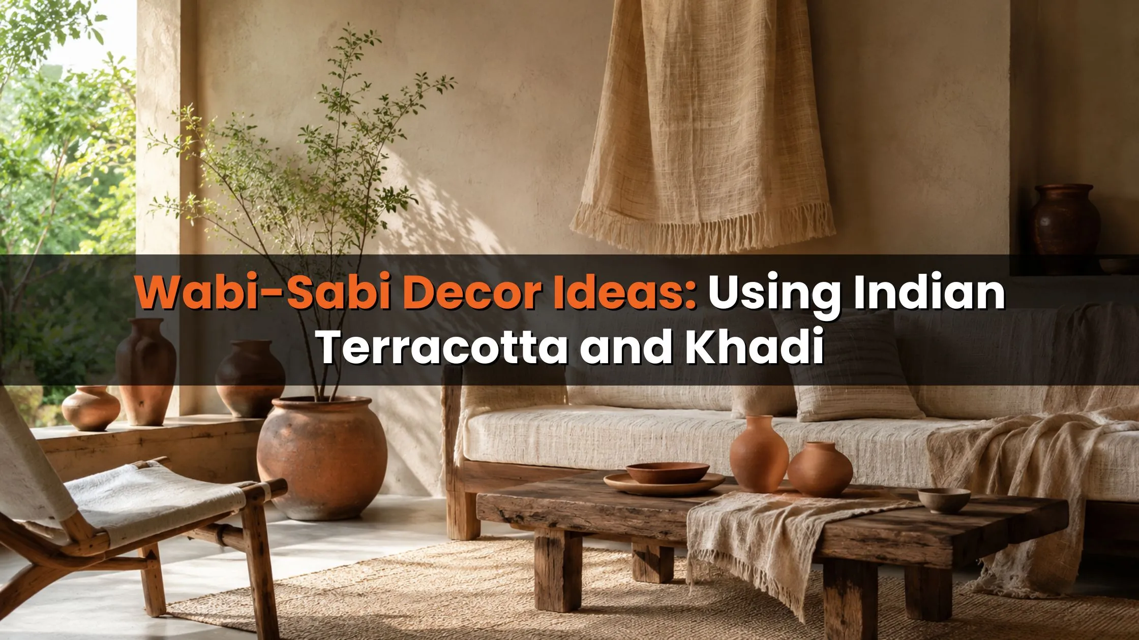
2. Earthy Tones and Nature-Inspired Shades
Description: Earthy tones like terracotta, olive green, and warm browns mimic the natural world and promote a calming atmosphere. These colours are perfect for creating a cozy and inviting environment.
Popular Combinations:
- Terracotta with olive green
- Warm brown with soft taupe
- Rust with deep green
Benefits:
- Promotes relaxation and tranquility
- Complements natural materials and textures
- Enhances the connection with nature
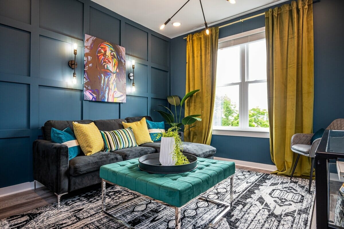
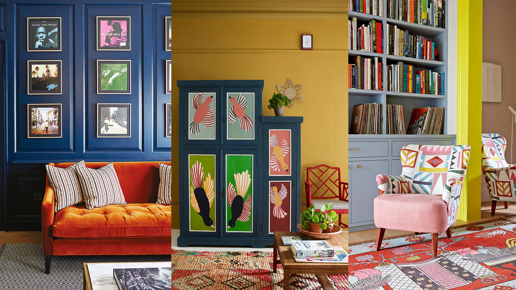
3. Bold Jewel Tones for a Luxurious Feel
Description: Jewel tones such as sapphire blue, ruby red, and amethyst purple add a touch of luxury and sophistication. These colours are ideal for creating dramatic and opulent interiors.
Also Read: 10 Stylish Sliding Door Designs for Contemporary Homes
Popular Combinations:
- Sapphire blue with gold accents
- Ruby red with charcoal grey
- Amethyst purple with cream
Benefits:
- Adds depth and richness to the space
- Creates a visually striking and memorable look
- Perfect for formal and elegant rooms
4. Monochromatic Schemes for a Modern Touch
Description: Monochromatic colour schemes use variations of a single colour to create a cohesive and streamlined look. This approach is perfect for modern and minimalist interiors.
Popular Combinations:
- Different shades of grey
- Various tones of blue
- Multiple hues of green
Benefits:
- Provides a clean and sophisticated appearance
- Enhances the sense of space and continuity
- Easy to coordinate with furniture and accessories

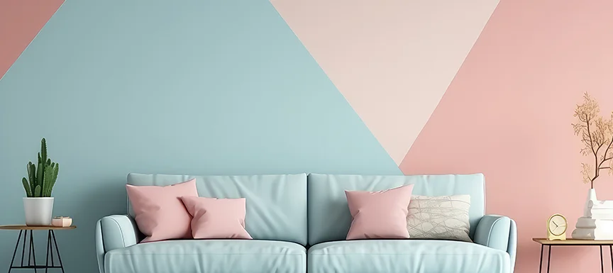
5. Pastel Colours for a Soft and Relaxing Atmosphere
Description: Pastel colours such as soft pink, mint green, and baby blue create a gentle and calming atmosphere. These colours are ideal for bedrooms and nurseries.
Popular Combinations:
- Soft pink with mint green
- Baby blue with lavender
- Pale yellow with white
Benefits:
- Promotes relaxation and serenity
- Ideal for creating soothing environments
- Easy to mix with other soft colours
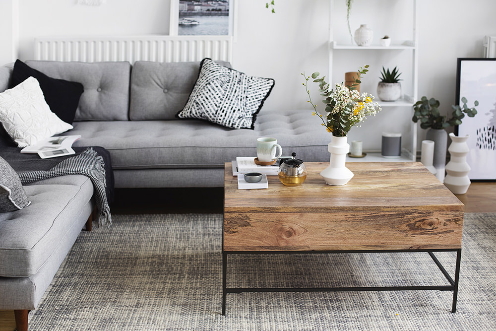
6. Industrial Greys with Warm Accents
Description: Industrial greys combined with warm accents like copper or brick create a stylish and contemporary look. This combination is perfect for modern lofts and urban apartments.
Also Read: How to separate spaces with partition walls?
Popular Combinations:
- Charcoal grey with copper accents
- Slate grey with warm beige
- Light grey with exposed brick
Benefits:
- Adds a touch of modernity and edge
- Balances cool tones with warm highlights
- Creates an urban and sophisticated atmosphere
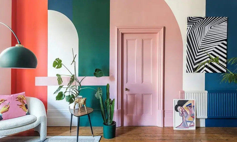
7. Vibrant Colour Blocking for a Fun and Energetic Space
Description: Colour blocking involves using bold, contrasting colours in distinct blocks or sections of a room. This technique is ideal for creating lively and dynamic interiors.
Popular Combinations:
- Bright orange and cobalt blue
- Vibrant pink and teal
- Lime green and purple
Benefits:
- Creates a visually stimulating and playful environment
- Perfect for children's rooms and creative spaces
- Allows for experimentation with bold colours
Tips for Choosing the Right Home Colour Design
1. Consider Your Space
Description: The size and function of your room will influence your colour choices. Light colours can make small spaces appear larger, while dark colours add depth to larger rooms.
2. Reflect Your Personality
Description: Choose colours that resonate with your personal style and preferences. Your home should reflect who you are and create a space where you feel comfortable and relaxed.
3. Coordinate with Existing Decor
Description: Ensure your chosen colour scheme complements your existing furniture, flooring, and accessories. A well-coordinated design creates a harmonious and cohesive look.
4. Experiment with Samples
Description: Before committing to a colour scheme, test samples on your walls to see how they look in different lighting conditions. This will help you make an informed decision.
5. Use Colour Theory
Description: Understanding basic colour theory can guide your choices. For example, complementary colours create contrast, while analogous colours provide a harmonious look.
Also Read: 10 Best Kitchen POP Design Ideas With Latest Images
 (1)_1784875521.webp)


Ans 1. In 2024, popular colour trends include classic neutrals with pops of colour, earthy tones, bold jewel tones, monochromatic schemes, pastels, industrial greys with warm accents, and vibrant colour blocking.
Ans 2. For small rooms, opt for light colours to make the space feel larger. Adding mirrors and using neutral tones with pops of colour can also help create a more open feel.
Ans 3. Earthy tones promote relaxation, create a cozy atmosphere, and complement natural materials, enhancing the connection with nature.
Ans 4. Use jewel tones as accent colours in accessories, artwork, or feature walls to add luxury and sophistication without overwhelming the space.
Ans 5. Yes, pastel colours can be used in modern homes to create a soft and calming atmosphere. Pair them with sleek, contemporary furnishings for a balanced look.