Table of Content
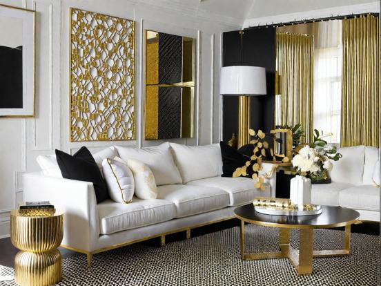
▲- 1. Gold & White: Pure Elegance
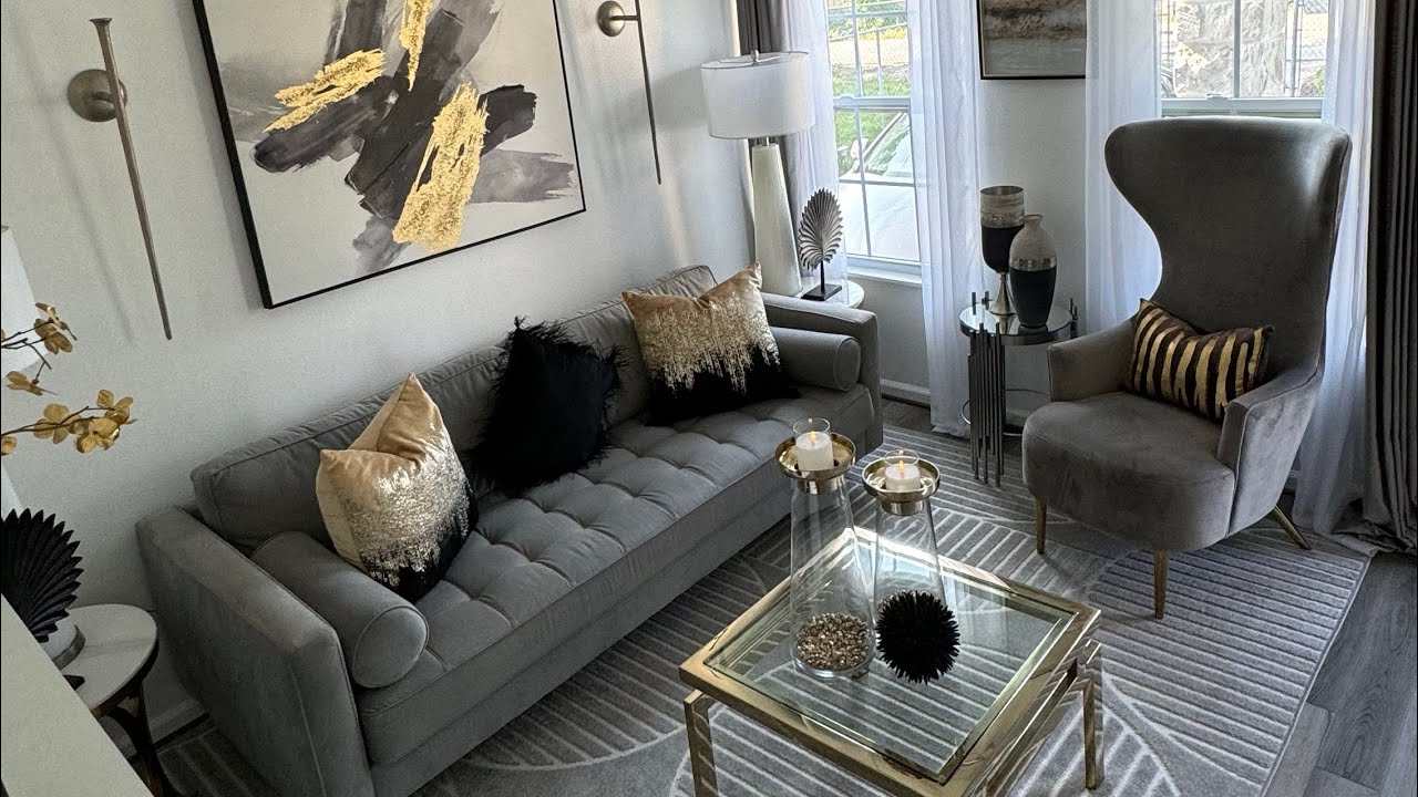
- 2. Gold & Black: Bold & Sophisticated
- 3. Gold & Grey: Modern Balance
- 4. Gold & Navy Blue: Regal Charm
- 5. Gold & Emerald Green: Rich & Natural
- 6. Gold & Cream: Warm & Understated
- 7. Gold & Burgundy: Luxurious & Dramatic
- 8. Gold & Teal: Unique & Vibrant
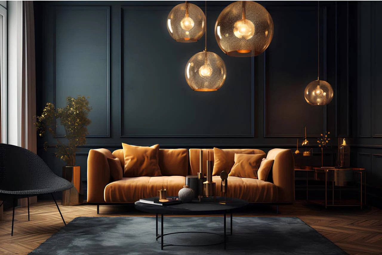
- 9. Gold & Orange: Warm & Energetic
- 10. Gold & Purple: Regal & Sophisticated
- 11. Gold & Brown: Earthy & Grounded
- Tips for Using Gold Color Combos in Home Decor
- Conclusion
Gold is a luxurious, timeless color that instantly adds a touch of elegance and warmth to any space. When used in the right combinations, Gold Color Combos can transform your home into a vibrant, sophisticated haven. In this guide, we’ll explore the top 11 gold color combinations that work beautifully in home decor. Whether you're redecorating your living room, bedroom, or even your home office, these stunning gold color combos are sure to elevate your space.
1. Gold & White: Pure Elegance

Why It Works:
The combination of gold and white is classic and timeless. White offers a clean, crisp backdrop that allows gold’s warm tones to shine without overwhelming the space.
Where to Use:
- Living rooms: Gold picture frames and decorative accents on white walls.
- Bedrooms: White bedding with gold fixtures or accent pieces for a luxurious, serene look.
Also Read: 11 Stunning Granite Kitchen Countertop Ideas for Your Home
2. Gold & Black: Bold & Sophisticated
Why It Works:
Gold paired with black creates a high-contrast, dramatic look. This duo exudes sophistication and makes a powerful design statement.
Where to Use:
- Dining areas: Gold tableware and lighting against a black dining table.
- Accent walls: Use gold wallpaper or art on a black wall for a striking visual impact.
3. Gold & Grey: Modern Balance
Why It Works:
Grey provides a neutral, calming balance to gold’s richness. This pairing is modern, refined, and perfect for creating a balanced ambiance.
Where to Use:
- Living rooms: Grey sofas with gold decorative cushions.
- Home offices: Grey walls with gold accents in furniture and accessories.
4. Gold & Navy Blue: Regal Charm
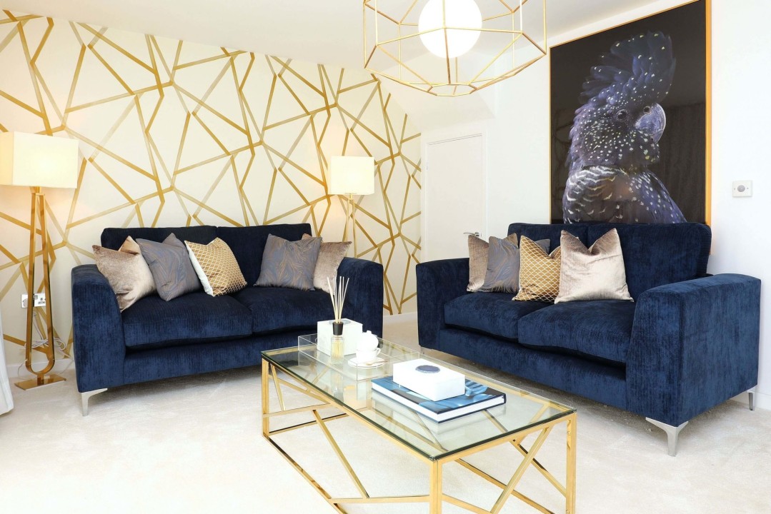
Why It Works:
Navy blue’s deep, cool tone contrasts beautifully with the warm glow of gold, resulting in a look that is both regal and contemporary.
Where to Use:
- Formal living areas: Navy blue drapes paired with gold decorative items.
- Bedrooms: Navy blue bedding with gold fixtures for a luxurious, serene atmosphere.
5. Gold & Emerald Green: Rich & Natural
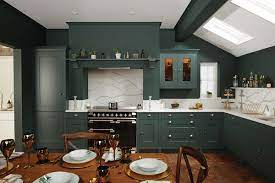
Why It Works:
Emerald green adds a natural, vibrant touch to gold, creating a dynamic and inviting color scheme. This combo is ideal for those who want to infuse their space with a touch of nature while maintaining a sense of luxury.
Where to Use:
- Kitchens: Emerald green cabinets with gold hardware.
- Living rooms: Emerald green accent chairs paired with gold decorative pieces.
6. Gold & Cream: Warm & Understated
.jpg)
Why It Works:
Cream is soft and soothing, offering a subtle contrast to gold’s opulence. This combination creates a warm, inviting atmosphere that is both elegant and understated.
Where to Use:
- Bedrooms: Cream walls with gold accents in bed linens and decor.
- Living spaces: Use cream-colored furniture with gold lighting fixtures to enhance a cozy, refined environment.
7. Gold & Burgundy: Luxurious & Dramatic
.jpg)
Why It Works:
Burgundy brings depth and richness to the mix, complementing gold’s lavish shine. This combination is perfect for those who love a dramatic yet elegant aesthetic.
Where to Use:
- Formal dining rooms: Burgundy tablecloths and chair upholstery accented with gold.
- Living rooms: Burgundy accent walls paired with gold decorative items for a sophisticated look.
Also Read: Top 11 Yellow Colour Combinations for a Stunning Look
8. Gold & Teal: Unique & Vibrant
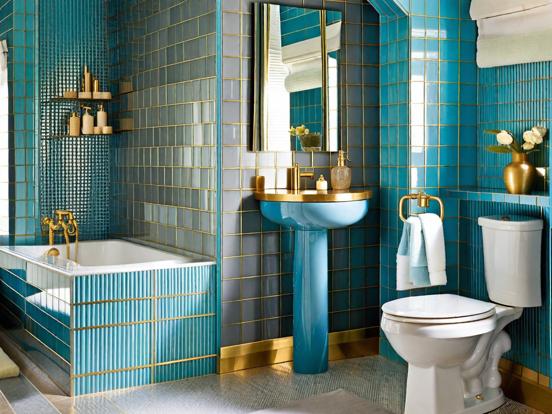
Why It Works:
Teal, a blend of blue and green, offers a refreshing contrast to gold. This combination is bold and creative, making it ideal for adding a unique twist to your home decor.
Where to Use:
- Bathrooms: Teal tiles with gold fixtures create a modern, spa-like atmosphere.
- Accent pieces: Teal cushions or artwork paired with gold frames for a pop of color.
9. Gold & Orange: Warm & Energetic
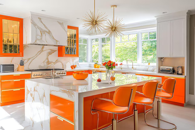
Why It Works:
Orange’s vibrant energy complements gold’s rich warmth, producing a palette that is both lively and inviting. This combination works best when used in moderation to create focal points.
Where to Use:
- Kitchens: Orange accent pieces with gold utensils or fixtures.
- Living rooms: Use orange throw pillows or art on a predominantly gold or neutral background for a festive touch.
10. Gold & Purple: Regal & Sophisticated
.jpg)
Why It Works:
Purple’s luxurious tone blends seamlessly with gold to create a majestic and sophisticated look. This combination is ideal for adding a touch of royalty to your space.
Where to Use:
- Bedrooms: Purple bedding or drapes with gold accents.
- Formal settings: Use gold and purple in decor elements like vases, lamps, or wall art to elevate the aesthetic.
11. Gold & Brown: Earthy & Grounded
Why It Works:
Brown offers an earthy, natural balance to gold’s brilliance, resulting in a harmonious and grounded color scheme. This pairing is especially effective in creating a cozy and warm environment.
Where to Use:
- Living rooms: Brown wooden furniture with gold decorative accents.
- Home libraries: Brown shelves or seating paired with gold lighting for a classic, timeless look.
Tips for Using Gold Color Combos in Home Decor
- Choose the Right Shade: Gold comes in various shades, from soft, muted tones to bright, metallic finishes. Select the shade that best complements your overall decor.
- Balance Proportions: Since gold is a bold color, use it strategically. Consider using gold as an accent color rather than the dominant one to avoid overwhelming the space.
- Mix Textures: Incorporate different textures, such as matte, glossy, and metallic finishes, to add depth and visual interest to your design.
- Experiment with Patterns: Pair gold with patterned fabrics or wallpapers to create dynamic and visually engaging spaces.
Conclusion
Gold Color Combos can truly elevate your home decor, adding a touch of luxury, warmth, and elegance to any room. From the classic pairing of gold and white to the bold contrast of gold and black, each combination offers a unique aesthetic that can be tailored to your personal style. Whether you’re looking to create a sophisticated living space, a vibrant dining area, or an eye-catching bedroom design, these top 11 gold color combinations provide a wealth of inspiration.
Embrace the power of Gold Color Combos to transform your home into a stunning, elegant space that reflects both luxury and modernity. Experiment with these combinations, balance bold accents with subtle hues, and let the brilliance of gold infuse your home with timeless beauty and style.
Also Read: 13 Stunning Royal Texture Paint Designs For Hall
 (1)_1784875521.webp)


Ans 1. Gold color combos involve pairing gold with other hues to create elegant, luxurious, and balanced interiors. These combinations enhance the aesthetic appeal of a space without overwhelming it.
Ans 2. Gold adds warmth, sophistication, and a touch of luxury, making it a timeless choice for enhancing both modern and traditional spaces.
Ans 3. Gold and white is a classic combination that offers a clean, elegant look, allowing gold accents to stand out against a crisp white backdrop.
Ans 4. Gold and black create a dramatic, high-contrast design ideal for accent walls or dining areas, offering a bold yet sophisticated look.
Ans 5. The neutral tone of grey balances gold’s warmth, creating a refined, contemporary ambiance perfect for living rooms or home offices.
Ans 6. Yes, pairing gold with orange or teal adds energy and uniqueness, making these combos suitable for accent pieces and statement areas.
Ans 7. Consider your overall decor; softer, muted golds blend well in understated spaces, while bright, metallic golds add a bold, luxurious touch.
Ans 8. Yes, incorporating various textures like matte, glossy, and metallic finishes enhances depth and visual interest in your design.
Ans 9. Absolutely, these combos are versatile and can be tailored to suit both home and office environments, adding sophistication and vibrancy.
Ans 10. Balance is key use gold as an accent rather than the dominant color, and ensure it complements your existing decor and overall design theme.